Goal
Take the default Shopify cart — one line item per row, one product at a time — and turn it into a B2B bulk-ordering grid: a per-style surface where a buyer enters quantities across every color and size at once, saves instantly as they type, and sees per-style totals without scrolling a mile-long cart.
No Shopify app, no headless stack, no framework. Just Liquid, the AJAX Cart API, the Section Rendering API, and a small custom element. This post is a condensed playbook of how the pieces fit, and the two or three decisions that make or break it.
We built this at DTAILS for a Copenhagen menswear brand migrating their wholesale workflow from Centra to Shopify Plus. The PR that shipped it was titled Add order grid section for bulk variant ordering — flat, no marketing. That’s about the level of complexity it actually is. What follows is the version that shipped, not the whiteboard version.
The wider point isn’t B2B-specific. It’s a good example of how far you can push Shopify’s native primitives when the user experience demands more than the default cart gives you — and how much cognitive load you can take off a user by replacing a long scroll with a dense, single-screen grid.
Key takeaways
- Shopify’s default cart is a starting point, not a constraint. For B2B and any high-volume ordering flow, rewriting the cart section is usually the right move — not reaching for an app.
- Three primitives do the heavy lifting: a
list.product_referencemetafield to link color variants, a Liquid grouping pass overcart.itemsusing the SKU prefix, and the Section Rendering API for cart updates. - Liquid has no data structures — grouping cart items by style is a string-sort-and-single-walk problem.
- The web component is ~200 lines. Debounce,
AbortController, andouterHTMLreplacement via the Section Rendering API. No framework. - Per-style mini-grids beat one mega-grid for any cart with more than a handful of styles — cognitive load stays flat.
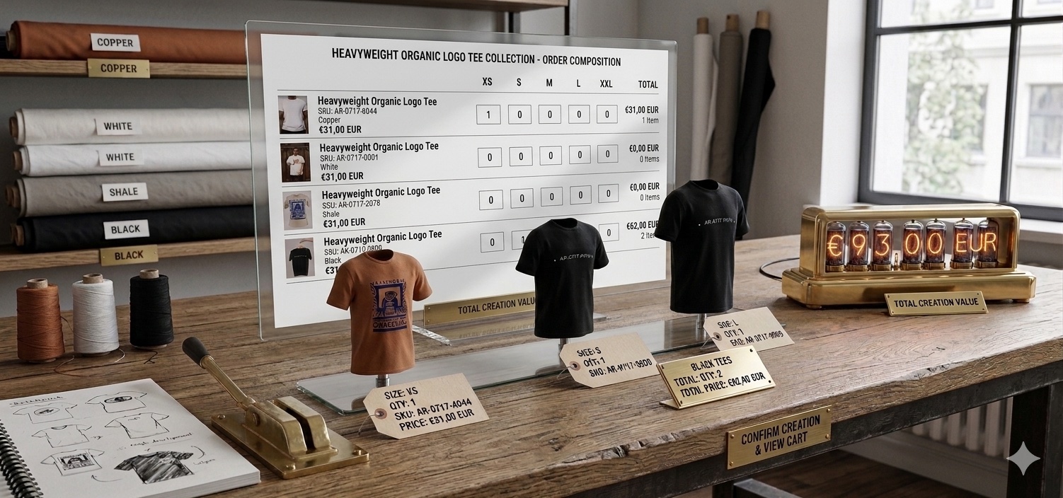
 Product page view: the current style and every linked color variant in a single grid. A buyer enters quantities across every size and color at once, then clicks View cart when the whole style is specced.
Why the default Shopify cart isn’t enough for B2B
D2C and B2B buyers optimize for different things. A D2C buyer wants one product, one quantity, a fast checkout. A B2B buyer wants to enter fifty numbers across fifteen styles in a single session, see totals by row, style, and grand total, and never lose their place.
Default Shopify gives you one line per variant and an “update cart” button. A wholesale session on that layout means hundreds of clicks, a cart the length of a novel, and a constant context switch between product page and cart page. It’s not a missing feature — it’s a missing UX pattern for a specific buyer type.
The fix isn’t a plugin. Most B2B apps on Shopify take over the storefront UI, lock you into their design system, and add third-party scripts to every product page. Going headless doubles the maintenance burden and turns theme-editor changes into developer tickets. The theme can do it natively, and the result survives platform updates.
What the feature looks like on the page
Two surfaces, one Liquid snippet, two contexts.
On the product page, an order grid shows the current style and every linked color variant. Rows are colors, columns are sizes, each cell is a quantity input. Sold-out variants render as disabled cells with ARIA labels. Stock counts render inline with a merchant-configurable cap so 247 reads as 20+.
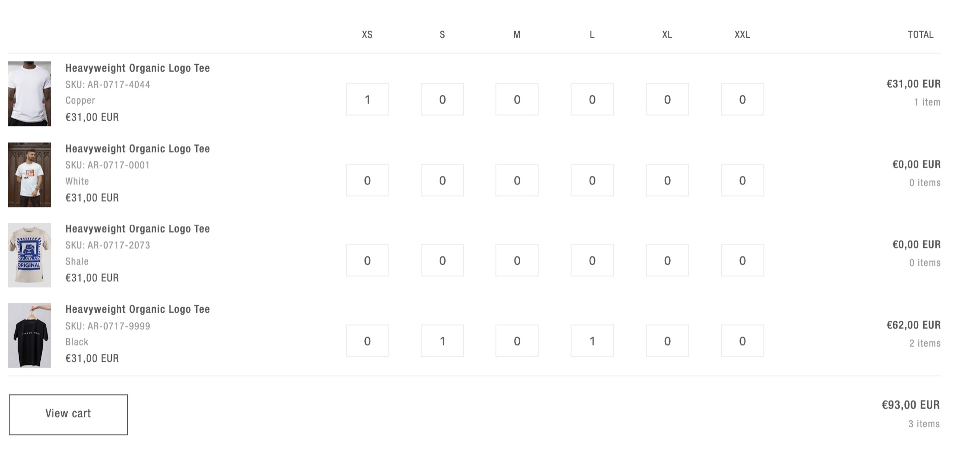
On the cart page, the same primitive renders once per style group. Everything the buyer added across the session is grouped into per-style mini-grids with per-style totals and a grand total, so a cart with thirty styles stays as readable as one with three.
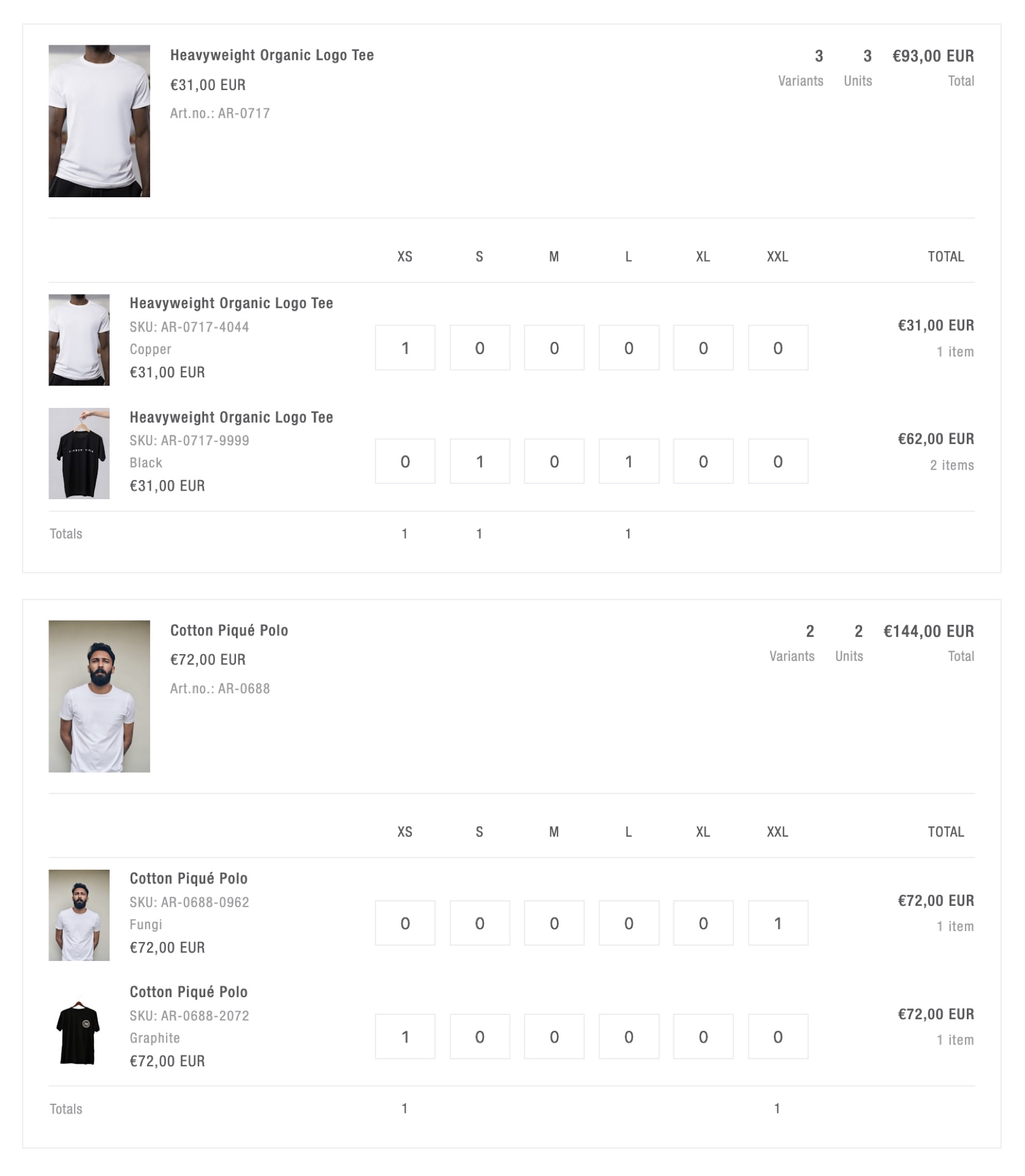 Cart page view: each style gets its own mini-grid with per-row totals, unit counts, and a per-style total. A cart with thirty styles stays as readable as one with three — cognitive load stays flat.
How the three moving parts fit together
This isn’t a drop-in snippet — your SKU convention, metafield keys, and cart logic will be different from ours. What’s portable is the shape of the solution. Three moving parts, one insight per part that’s easy to get wrong.
Linking color variants
Colors of a style are separate products in Shopify — different SKUs, different inventory, different images. Don’t try to model them as variants of one product; link them with a list.product_reference metafield on the style. The product-page grid iterates product plus every referenced product, and each contributes one row.
The insight: keep the linking data in the Shopify admin, not in your theme or an external source. A new color added to a style is a metafield update, not a developer ticket, not a pipeline job. That single decision is what makes the whole feature survive on a real store.
Grouping cart items by style in Liquid
Liquid has no arrays of objects and no hash maps. “Group cart.items by style” is a string problem, not a data-structures problem.
The pattern: encode each cart item as a single delimited string, concatenate the strings, split-and-sort alphabetically so same-style entries fall adjacent, then walk the sorted list once and flush a group whenever the style prefix changes. If your SKU scheme is category-style-color-size (e.g. AR-0717-9999-XS), the “style prefix” means dropping the last two segments — so you can’t just slice a fixed number of parts. You have to compute the keep-count per item.
{%- liquid
  assign sort_entries = ''

  for item in cart.items
    assign sku_parts = item.variant.sku | split: '-'
    assign keep = sku_parts.size | minus: 2
    assign base_sku = ''

    for part in sku_parts
      if forloop.index0 < keep
        if base_sku != ''
          assign base_sku = base_sku | append: '-'
        endif
        assign base_sku = base_sku | append: part
      endif
    endfor

    assign entry = base_sku
      | append: ':::' | append: item.product_id
      | append: ':::' | append: item.variant.id
      | append: ':::' | append: item.quantity

    if sort_entries == ''
      assign sort_entries = entry
    else
      assign sort_entries = sort_entries | append: '|||' | append: entry
    endif
  endfor

  assign sorted_list = sort_entries | split: '|||' | sort
-%}
Two traps worth naming before you write it yourself.
First, the final split and for that consumes sorted_list has to live outside the {% liquid %} block. Render tags inside {% liquid %} must be single-line. An inline loop throws a cryptic Unknown tag error that sends you in the wrong direction for an hour.
Second, pre-compute per-group totals — unit count, total price, the header product id — during the grouping pass and pack them into the group string. If your sub-snippets re-iterate cart.items to calculate their own totals, a thirty-style cart runs the cart loop thirty times in a single render. You won’t catch it in QA. You’ll catch it the first time a real wholesale cart loads.
On the PR that landed the per-style refactor, an automated code-review bot flagged that the desktop and mobile sub-snippets ran the same ~40 lines of cart-iteration logic twice per group. Pushing that computation up into the parent grouping pass and passing the results in as parameters wasn’t an optimization — it was the difference between one cart.items walk per render and N walks per render. On a thirty-style wholesale cart, that’s the difference between instant feedback and a 300ms stutter every time a quantity changes.
One more trick paid off in the same refactor. The group-finalization logic naturally needs to run in two places — once each time the base SKU changes inside the loop, and once after the loop to flush the tail group. That’s two copies of ~25 lines of totals math, drifting apart over time. Appending a sentinel entry with a base SKU that can’t collide with any real one (~~~ZZZ_SENTINEL~~~) means the “base SKU changed” branch fires one last time and flushes the tail through the single canonical path. One code path, one place to maintain.
Instant-save updates with the Section Rendering API
A buyer typing quantities fires change events faster than you can safely hit /cart/update.js. Three parts in the custom element handle it: a Map of pending updates keyed by variant id, a 300ms debounce, and an AbortController to cancel in-flight requests when newer edits land.
async flush() {
  if (this.pending.size === 0) return;

  const payload = Object.fromEntries(this.pending);
  this.pending.clear();

  this.controller?.abort();
  this.controller = new AbortController();

  try {
    const res = await fetch('/cart/update.js', {
      method: 'POST',
      headers: { 'Content-Type': 'application/json' },
      body: JSON.stringify({ updates: payload, sections: this.sectionId }),
      signal: this.controller.signal,
    });

    const data = await res.json();
    if (!this.isConnected) return;

    const html = data.sections?.[this.sectionId];
    const fragment = new DOMParser()
      .parseFromString(html, 'text/html')
      .querySelector(`#${CSS.escape(this.sectionId)}`);

    if (fragment) this.outerHTML = fragment.outerHTML;
    document.dispatchEvent(new CustomEvent('cart:change', { detail: data }));
  } catch (err) {
    if (err.name === 'AbortError') {
      // Re-queue aborted variants, but newer edits always win.
      for (const [id, qty] of Object.entries(payload)) {
        if (!this.pending.has(id)) this.pending.set(id, qty);
      }
      this.debouncedFlush();
    }
  }
}
The Section Rendering API is what makes the replacement cheap — Shopify re-renders the section server-side and hands you back the HTML, so your client never has to know how to render a grid.
Two gotchas that will bite you otherwise:
- Re-queue aborted payloads, don’t drop them. When you abort an in-flight request, the variants in that payload still need to land eventually — but only if a newer edit hasn’t already replaced them. Newer edits always win.
- Check
isConnectedbefore writingouterHTML. A debounced flush can fire after the element has been replaced by a previous flush. Without the guard, rapid typing across two cells crashes the grid. Hard to catch in manual QA; easy to reproduce with two fast keyboards.
Per-style mini-grids beat one mega-grid
The first version we shipped was the mega-grid: every size column from every style unioned into one table. Buyer feedback came back almost immediately — that wasn’t how Centra worked, and on a thirty-style cart it shouldn’t be how this one works either. The refactor to per-style mini-grids shipped as a separate PR.
The first honest iteration of a grouped cart is usually “union every size across every product into one table and disable the cells that don’t apply.” It seems tidy. It isn’t.
Fifteen styles with different size grids — apparel XS–XXL, chinos 28x30–36x34, caps OS — collapsed into one table means ~80% of cells are disabled. Cognitive load scales linearly with every style added. Per-style mini-grids, each only showing the size columns its variants actually use, are what buyers actually scan.
The refactor is zero JavaScript. Once the Liquid grouping pass exists, each group renders its own <table> with its own columns. The <order-grid> custom element wraps the whole cart section, so debounce, abort, and section replacement keep working untouched.
What this approach buys you
- No app subscription, no iframe, no vendor UI lock-in.
- Theme-editor configurable. Image, SKU, color description, RRP, stock cap, mobile behavior — every cosmetic decision is a section schema toggle.
- Inventory-aware. Sold-out and oversell-protected variants disable automatically. Stock renders with a merchant-defined cap.
- Accessible by default. Semantic
<table>, per-input ARIA labels, keyboard navigation, mobile stacked-card fallback under 700px. - Survives theme updates. It’s a normal section and a normal custom element. Nothing bespoke under the platform, nothing that rots when Shopify ships a new feature.
- Shopify-native. Built on metafields, sections, the AJAX Cart API, the Section Rendering API, and Liquid. No custom backend, no external data source, no pipeline.
When this approach doesn’t fit
The honest flip side. A theme-level order grid is the right answer for a lot of B2B stores, but not all of them.
- When you need approval workflows, PO numbers, or multi-level buyer catalogs, Shopify Plus B2B Companies is the better base. Those flows want server-side state and permissions, not a clever cart section.
- When the catalog is 10,000+ SKUs with inconsistent naming conventions, the string-grouping pattern stops scaling. The cart loop is O(n) and the sort is O(n log n), but more importantly the “derive the style key from the SKU” assumption breaks the moment the SKU scheme isn’t uniform. At that scale you want grouping driven by a metafield key, not by string slicing.
- When buyers need quote-style carts — save as draft, send for approval, convert to order later — you’re not using Shopify’s cart anymore. That’s a draft-orders or a custom app problem, not a theme problem.
If any of the above describes your brief, reach for the right tool. The theme-native version wins when the workflow is still “put things in a cart and check out,” just denser than D2C.
Frequently asked questions
Can you build a B2B bulk-ordering grid in Shopify without an app?
Yes. A Shopify theme can render a per-style B2B bulk-ordering grid using a list.product_reference metafield for color linking, a Liquid grouping pass over cart.items keyed by SKU prefix, and a small custom element that talks to the AJAX Cart API and the Section Rendering API. No Shopify app, no headless storefront, no framework required.
How do you group Shopify cart items by style in Liquid?
Liquid has no data structures, so grouping is a string problem. Encode each cart item as a single delimited string, concatenate all entries with a separator, split and sort alphabetically so same-style entries become adjacent, then walk the sorted list once — flushing a group whenever the style prefix changes.
What is the Shopify Section Rendering API?
The Section Rendering API lets you POST to cart endpoints like /cart/update.js with a sections parameter, and Shopify returns the re-rendered HTML for those sections. You replace the DOM via outerHTML with the returned fragment, keeping the cart state and the rendered markup in sync without a page reload.
Why not use a B2B Shopify app instead?
B2B apps typically inject an iframe or a third-party renderer onto every product page, adding 50–200 KB of script and a render dependency that breaks when the vendor ships a regression. A theme-level implementation lives in your Git history, has zero runtime dependencies, and survives theme updates — the cart behavior is built from Shopify’s own primitives, not bolted on top of them.
What’s the benefit of per-style mini-grids over a single grid?
A single unified grid unions every size column across every product — apparel, chinos, caps all share the same columns. With multiple style types, ~80% of the resulting cells are disabled. Per-style mini-grids show only the columns each style actually uses, so cognitive load stays flat regardless of how many styles are in the cart.
Takeaway
Shopify’s native primitives — metafields, sections, the AJAX Cart API, the Section Rendering API, and a single well-scoped custom element — cover more ground than most teams reach for them. “We need a B2B ordering grid” doesn’t have to mean “we need an app” or “we need to go headless.” Most of the time it means one Liquid snippet, one grouping pass, and ~200 lines of modern JavaScript.
The broader lesson isn’t about B2B. It’s that the default cart is a starting point, not a constraint. When the default doesn’t fit the user, you rewrite the section — not the stack.
I’m Tomasz, a senior Shopify Plus developer at DTAILS. If you’re evaluating whether your B2B workflow fits inside a Shopify theme — or whether you’ve already outgrown that — get in touch or connect on LinkedIn. I’m happy to trade notes either way.